Table of Contents
Technically speaking, color is simply the retransmission of visible energy that is not absorbed by an object. Visible light is a portion of the electromagnetic spectrum that humans have evolved to see within a frequency range of 400-700 terahertz. But in its most visceral form, color is energy, universally transcending language and culture.
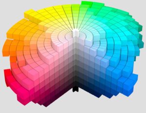
The Munsell color system (Figure 1) is a color space that identifies color based on three properties: hue (basic color), chroma (color intensity), and value (lightness). It was created by Albert H. Munsell in the early 20th century and adopted by the U.S. Department of Agriculture as an official color system for soil research in the 1930s.
This early work was refined in 1929 and further enhanced in the 1940s, resulting in the modern Munsell Book of Color. The Optical Society of America’s Uniform Color Scales and the CIELAB L*a*b and CIECAM02 color models used in the paint and color industry today were built on the Munsell color system. The original Munsell color chart is still used today to compare computer models of human color vision.[1]

The perception of color elicits linguistic and emotional responses that vary across cultures. The human eye perceives millions of differentiated colors. However, human language groups color into much smaller categories. Some primitive languages use as few as three words corresponding to black, white, and red to identify color, while industrialized languages can have as many as 12 language categories comprising differentiated subsets.
A 2017 MIT study of 100 languages found that the “warm” part of the color spectrum elicits more color words such as orange, yellow, and red compared to “cooler” color regions like blue and green. In fact, the cooler colors are often identified differently by people using the same language. The premise is that “warmer” colored objects are more easily distinguished—making warm color labels more consistent even across cultures.[3] Language universally prefers to bring more color words to warmer parts of the spectrum as opposed to the cooler segments.
Since 1994, there have been a plethora of studies trying to understand emotional response as a function of color. These in-depth studies parsed color to the point of focusing on hue, chroma, and lightness as individual harbingers of emotional response. After much analysis and debate around emotional responses associated with specific colors, hues, physical events, objects, or physical space, the conclusion was that “a color-related emotion is highly dependent on personal preference and one’s past experience with that particular color.”[4]
Pantone Color of the Year
The real conclusion from all these studies is that color has an inherent psychological effect on the human psyche—it influences mood, energy level, inspiration, and accomplishment. So it is no surprise that the industry most responsible for generating color has hosted a contest for itself since 2000. The express purpose of the event is to harness one color each year to be THE manifestation of the next year’s forecast as influenced by societal changes, economic and political climates, environmental shifts, and technological and scientific advancements.
Since 2000, the Pantone Color Institute has selected its “Color of the Year.” Trends from all aspects of society are studied throughout the year, considering the collective research generated by traveling observers of culture, nature, and events all over the world.
Pantone’s first selection, a blue hue called Cerulean, was hailed as “the color of the millennium.” The zeitgeist for this selection was the desire for inner peace and fulfillment during uncertainty while simultaneously reflecting on the past while looking toward the future promised by the new millennium.
In the first few years, color trend forecasting was interesting and novel—with comparatively few designers taking advantage of these winning colors through 2007. However, between Honeysuckle in 2011 and Tangerine in 2012, Pantone’s Color of the Year took on a life of its own. It was around that time that major paint brands began to participate in earnest.
Today, when a new Color of the Year is announced, Pantone blankets designers with an array of products and color palettes designed around the winner, promulgating huge influence in the world of design and brand marketing. And we should care about which color Pantone selects for Color of the Year because, in effect, all that research centers around what we, as societal people, turn to when we need comfort, inspiration, energy, refreshment, hope, calm, or simply a change. In a sense, we choose the color.
Recent Color Trends
In 2020, the Colors of the Year were earth tones designed to denote safety and grounding. One of the few times that there were two selections for color of the year was in 2021, when rock-solid Ultimate Gray and the cheerful yellow Illuminating were selected. This marriage of color conveyed a strength, resilience, and hopefulness that the executive director of Pantone described as enduring and uplifting—a message of happiness supported by fortitude.
The 2022 colors were cautiously optimistic—primarily in soothing tones of green. Interestingly, Pantone’s 2021 Color of the Year did not follow the green trend and instead introduced a bold periwinkle called Veri-Peri, which was inspired by the increasing time spent in the metaverse.

In 2023, the kid gloves of uncertainty and isolation finally came off. Warm, nature-inspired hues with tones for nurturing and wellbeing will offer coziness and comfort. All the 2023 Colors of the Year feed into the desire for comfort, the need for simplicity, and the aching for variety satisfied with colors all over the palette. If there is a green color offering, it is uncharacteristically bold, vibrant, and deep.
Even Etsy joined the party and offered a 2022 Color of the Year. The hyper-stylish Emerald Green was a bright, bold choice in a field of softer sage greens. For 2023, Etsy paired with Sherwin-Williams’ Redend, bringing it to life with a curated selection of home accents and accessories.
Robert Kaufman Fabrics announced its first Color of the Year in 2021 with a bright, bold purple called Cosmos. The 2023 Color of the Year will be announced in December, and the excitement is building on the Kona Cotton ordering site frequented by quilters and other textile artisans.
Even RoomMate Décor, the largest manufacturer of wall decals and decorative peel-and-stick products in North America, took advantage of the hype and buzz and announced its own Color of the Year in 2021. Its Green Aloe was a natural, fresh shade of green, leaning into that year’s symbolic trend of growth, healing, optimism, and joy. That was followed by Cream Moonstone in 2022, selecting a versatile neutral that acted as a calming oasis, projecting warmth and softness. No hint yet as to the 2023 RoomMate Décor Color of the Year—the palette choices are so broad.
New Year, New Hues
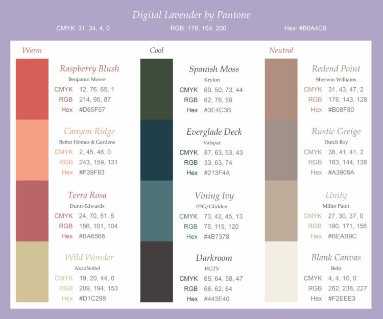
The Pantone Color Institute is forecasted to announce Digital Lavender as the 2023 Color of the Year as suggested by WGSN in collaboration with Coloro. This hue nods to the feelings of isolation and the merging lines between the physical and digital world.
This purple is slated to take over the fashion world and be important for consumer electronics, digitized wellness, mood-boosting lighting, and home goods and accents. The sensory quality is perfect for therapeutic self-care and wellness products, peace, and serenity. Research suggests that this color will be readily accepted by all generations and celebrated by Gen Z.[5,6]
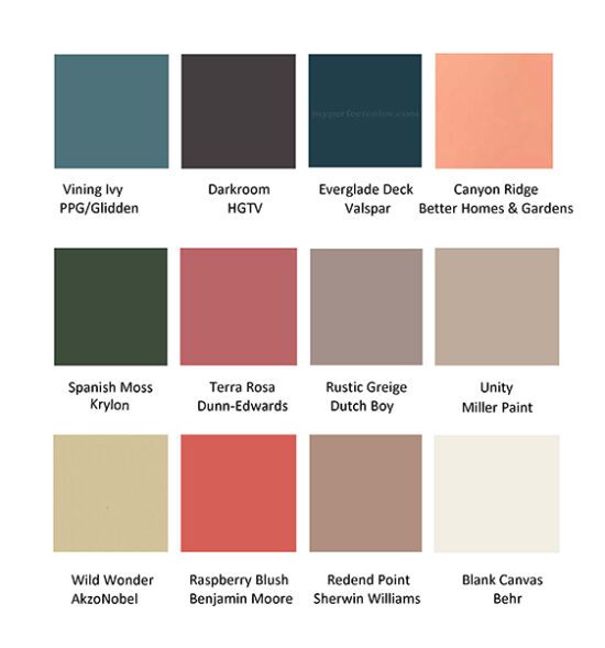
Since 2011, increasing numbers of paint brands have been leaping onto the Color of the Year bandwagon—taking advantage of the increasing publicity generated from the buzz and hype associated with these carefully researched color selections and exquisitely timed announcements. The 2023 Colors of the Year exhibit a desire for comfort, simplicity and variety. Unlike the overwhelmingly green color selections of 2022, the 2023 offerings are all over the color palette. This year, no one hue trend dominates—yet. From the maximalism of a vivid raspberry to safe minimalist white, there is something for everyone.
And the Winners Are…
Benjamin Moore: Raspberry Blush
This is a vivid, charismatic, red-orange hue, the lead color in the Color Trends 2023 Palette. Andrea Mango, color marketing and development director at Benjamin Moore, said that the inspiration for this color was that “people are ready to bring color back into the home, taking a step outside their comfort zones.”
These confident shades “empower the use of statement colors that deliver delight and personality.” This color is the 2023 height of maximalism and deserves a try on your favorite wall.7
Sherwin-Williams: Redend Point
Sue Wadden, director of color marketing at Sherwin-Williams, stated that this “soulful blush-beige” hue was “inspired by the idea of finding beauty beyond ourselves a heartening hue that invites compassion and connection into any space.”
The soulful vigor of this color envelops any room, gives the feeling of a warm hug, and creates feelings of warmth, motivation, and comfort. This color emotes energy, providing confidence and heightening creativity, especially within the social center of the home.[7]
Behr: Blank Canvas
This year, Behr upended the bold color trend by delivering a warm, neutral white to provide a sense of renewal and fresh starts. Blank Canvas is a great neutral, providing a clean feeling throughout the home without being bland, garish, or harsh.
The warm undertones feed into the feeling of safety. It can be used within a monochromatic minimalist design or paired with a set of colorful accent pieces, drapes, or furniture.[8]
I’ll admit that these three 2023 Colors of the Year are the ones that “spoke” to me, energizing my mood and heightening creative instincts. The remaining 2023 Colors of the Year (Figure 2) serve to solidify reflections of current trends, as the warm, earthy hues—suitable for softer, cozier spaces—connect us with nature, serenity, and safety (and thankfully, without a hint of pale green).
Most importantly, the Color of the Year palette is all about exploring variety. In short: there is something that will resonate with everyone.

Colors of the Year are reminiscent of runway couture—beautiful, striking, rich colors that are poised to become mainstream as they offer consumers, designers, artists, decorators, and fabric and accent pieces a basis for blending beauty and elegance with practicality. It will be interesting to see which of these colors break through to become sought after and, more importantly, timeless.
For more information, contact the author at cgosselin@chemquest.com.
References
1. Ottosson, Björn, “A Perceptual Color Space for Image Processing,” Blog post, December 23, 2020, https://bottosson.github.io/posts/oklab/ (accessed Oct 31, 2022).
2. Munsell 1943 Color Solid Cylindrical Coordinates.png. Wikimedia Commons.
3. Trafton, Ann, “Analyzing the Language of Color,” MIT News Office, September 18, 2017.
4. Kaya, N., and Epps, H. H., “Relationship between color and emotion: A study of college students,” College Student Journal, 2004, 38(3), 396–405.
5. LeFevre, Camille, “Coloro + WGSN 2023 Colour of the Year: Digital Lavender” Midwest Home, October 4, 2022.
6. Brama, Shrestha, “Digital Lavender Color of the Year,” The Fashion Frill, October 22, 2022.
7. Buckman, Anna, “2023’s Paint Colors of the Year Offer Something for Everyone,” TRZ, October 18, 2022.
8. Dohman, Katie, “Behr Paint’s Color of the Year 2022 is ‘Blank Canvas,’” Family Handyman, September 29, 2022.
See the article in CoatingsTech.

